
.webp)
.png)
%201.svg)
Continuity of elements on a website across browsers is essential. I was excited to be asked to create a ReactJs tutorial for a custom select element, so that when implemented on a website the dropdown menu looks the same in all browsers. This type of dropdown menu in CSS can be necessary because the built-in browser select element design differs from one browser to another.
I will take you through how I developed a simple custom select element using ReactJs and styled-components. Enjoy!
First, you need a development environment to build in. When I am working on a project like this, I use a codesand box, but feel free to use a ReactJs environment or you can use create-react-app on your personal computer.
Here is the fun part:
The best way to write this project's CSS rules/styles is by using styled-components. Installing that program is easy using the code below.
npm install --save styled-components
or
yarn add styled-components
Structure
After you have installed the correct dependency, you need to consider the structure of the select/dropdown custom element.
See the example below:
import React from "react";import styled from 'styled-components';const DropDownContainer = styled("div")``;const DropDownHeader = styled("div")``;const DropDownListContainer = styled("div")``;const DropDownList = styled("ul")``;const ListItem = styled("li")``;export default function App() { return ( <div className="App"> <h1>Custom Select/dropdown</h1> <DropDownContainer> <DropDownHeader>Mangoes</DropDownHeader> <DropDownListContainer> <DropDownList> <ListItem>Mangoes</ListItem> <ListItem>Apples</ListItem> <ListItem>Oranges</ListItem> </DropDownList> </DropDownListContainer> </DropDownContainer> </div> );}
view rawcustom-select-element-structure.js hosted with ‚ù§ by GitHub
We are going to style the different JSX elements such as the div ul and li elements using the styled import from styled-components. Each component will be returned as a React element.
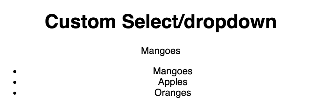
The umbrella div container for the entire select is the DropDownContainer, the DropDownHeader will show the selected option, and the DropDownListContainer is the div that contains the unordered DropDownList. The ListItems are the children. Mangoes, apples, and oranges are the current select options in our example below.
Styles/design
Styles that can be added to the custom select element to make it more unique. Check out the image below to see some examples of ways you can apply styles.
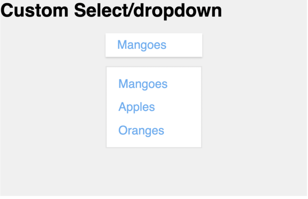
To style your dropdown the same way that our example shows, I have provided the code along with an explanation of each element.
import React from "react";import styled from "styled-components";const Main = styled("div")` font-family: sans-serif; background: #f0f0f0; height: 100vh;`;const DropDownContainer = styled("div")` width: 10.5em; margin: 0 auto;`;const DropDownHeader = styled("div")` margin-bottom: 0.8em; padding: 0.4em 2em 0.4em 1em; box-shadow: 0 2px 3px rgba(0, 0, 0, 0.15); font-weight: 500; font-size: 1.3rem; color: #3faffa; background: #ffffff;`;const DropDownListContainer = styled("div")``;const DropDownList = styled("ul")` padding: 0; margin: 0; padding-left: 1em; background: #ffffff; border: 2px solid #e5e5e5; box-sizing: border-box; color: #3faffa; font-size: 1.3rem; font-weight: 500; &:first-child { padding-top: 0.8em; }`;const ListItem = styled("li")` list-style: none; margin-bottom: 0.8em;`;export default function App() { return ( <Main> <h1>Custom Select/dropdown</h1> <DropDownContainer> <DropDownHeader>Mangoes</DropDownHeader> <DropDownListContainer> <DropDownList> <ListItem>Mangoes</ListItem> <ListItem>Apples</ListItem> <ListItem>Oranges</ListItem> </DropDownList> </DropDownListContainer> </DropDownContainer> </Main> );}
view rawcustom-select-element-styles.js hosted with ‚ù§ by GitHub
By default, the background of the list is white, but so that we can see the selections better, we changed the Main background by changing the <div className=”App”> to <Main> and adding a background and height.
For this ReactJs tutorial, we have given the DropDownContainer a custom select width and a margin that centers the custom select.
As you can see from the example, we added a box shadow and a bottom margin to the DropDownContainer style so that there is a separation between the header and the list of items.
Please pay special attention to the section below, as it is a specific style for the DropDownList.
&:first-child { padding-top: 0.8em;}
It adds a padding-top to the first child of the DropDownList(ul) because Mangoes is the first ListItem(li).
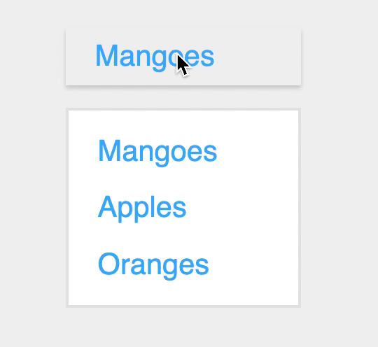
Behavior
Now that we have added some style elements to the new custom select, we need to code the necessary behavior when clicking the header. The result should be that the list is shown or hidden when clicked.
To achieve our goal, we are using React Hooks to use an isOpen boolean to toggle the list's visibility using the snippet provided.
const [isOpen, setIsOpen] = useState(false);
Then add a click handler that will be responsible for toggling the boolean to either true or false as shown below.
const toggling = () => setIsOpen(!isOpen);
The click listener is then attached to the DropDownHeader so that when a user clicks, the isOpen state variable toggles to either true or false.
<DropDownHeader onClick={toggling}>Mangoes</DropDownHeader>
Last, add the code snippet shown below so that the isOpen state variable is used to either show or hide the DropDownListContainer.
{isOpen && (<DropDownListContainer><DropDownList><ListItem>Mangoes</ListItem><ListItem>Apples</ListItem><ListItem>Oranges</ListItem></DropDownList></DropDownListContainer>)
Here is all the code up to this point.
import React, { useState } from "react";import styled from "styled-components";const Main = styled("div")` font-family: sans-serif; background: #f0f0f0; height: 100vh;`;const DropDownContainer = styled("div")` width: 10.5em; margin: 0 auto;`;const DropDownHeader = styled("div")` margin-bottom: 0.8em; padding: 0.4em 2em 0.4em 1em; box-shadow: 0 2px 3px rgba(0, 0, 0, 0.15); font-weight: 500; font-size: 1.3rem; color: #3faffa; background: #ffffff;`;const DropDownListContainer = styled("div")``;const DropDownList = styled("ul")` padding: 0; margin: 0; padding-left: 1em; background: #ffffff; border: 2px solid #e5e5e5; box-sizing: border-box; color: #3faffa; font-size: 1.3rem; font-weight: 500; &:first-child { padding-top: 0.8em; }`;const ListItem = styled("li")` list-style: none; margin-bottom: 0.8em;`;export default function App() { const [isOpen, setIsOpen] = useState(false); const toggling = () => setIsOpen(!isOpen); return ( <Main> <h1>Custom Select/dropdown</h1> <DropDownContainer> <DropDownHeader onClick={toggling}>Mangoes</DropDownHeader> {isOpen && ( <DropDownListContainer> <DropDownList> <ListItem>Mangoes</ListItem> <ListItem>Apples</ListItem> <ListItem>Oranges</ListItem> </DropDownList> </DropDownListContainer> )} </DropDownContainer> </Main> );}
view rawcustom-select-element-behaviour.js hosted with ‚ù§ by GitHub
Selected option
We add a new state variable using React hook so that we can get and store a selected option from the custom select we have created.
const [selectedOption, setSelectedOption] = useState(null);
To complete the functionality of the new custom element, we need to add a click handler so that a selected option will be called when an option is clicked. We can add this to the selectedOption by using the click handler code snippet below.
const onOptionClicked = value => () => { setSelectedOption(value); setIsOpen(false); console.log(selectedOption);};
If you look at the code, you will notice that we set the setIsOpen to false and log out the selected option/value. This is because we want to hide the list when an option is clicked and the value parameter is selected.
We also created an array of the list item values to map over them and make their ListItem as shown below.
const options = ["Mangoes", "Apples", "Oranges"];
Below is mapping of the options:
<DropDownList> {options.map(option => (<ListItem onClick={onOptionClicked(option)} key={Math.random()}> {option}</ListItem>))}</DropDownList>
By adding a click handler to each ListItem, we can make sure its value is passed along to the function each time a user clicks on that item. Also, a unique key is added because React needs to keep tabs on each ListItem.
Below is the Github gist for the code up until this point:
By following each of the steps outlined in this ReactJs tutorial, you will have no problem creating a custom select element dropdown menu for your own site. From here, feel free to add additional elements like a hover effect or a focus text color to your ListItem. You also may want to add an up or down arrow so that the list visibility changes or code a behavior that would make the DropDownListContainer position absolute. There are plenty of other tutorials to check out on Github.
Check out the code on GitHub.
Are you a React.js developer looking for your next role? Apply to join the Andela Talent Network today.

